Statistical Interpretation of Tabular Data, Part 4
Advanced statistical visualization techniques for data interpretation, including dendrograms, Spearman rank correlation, and partial dependence plots.
Series: Kaggle Competition Deep Dive Tabular Data
Advanced Missing Value Analysis in Tabular Data, Part 1
Decision Tree Feature Selection Methodology, Part 2
RandomForestRegressor Performance Analysis, Part 3
Statistical Interpretation of Tabular Data, Part 4
Addressing the Out-of-Domain Problem in Feature Selection, Part 5
Kaggle Challenge Strategy: RandomForestRegressor and Deep Learning, Part 6
Hyperparameter Optimization in Deep Learning for Kaggle, Part 7
Statistical Interpretation of Tabular Data, Part 4
Dendrogram Visualization For Spearman Rank Correlations
With the scipy library, one can create a Dendrogram using the features in the training set. Using the Spearman rank correlation (\(\rho\)), which does not have any prerequisites in terms of the relationships between the features, e.g., a linear relationship, the rank correlation is used to calculate the correlations. The final plot applies the same color to features whose rank correlation values are close to each other. On the x-axis, one can see the strength of the correlation, with close to zero indicating that the assumed linear relationship between the features in this group is one of no consistent change. Values close to one indicate a close to perfect monotonic relationship. \(H_0\) is that each variable pair is uncorrelated.
def cluster_columns(df, figsize=(12, 12), font_size=10):
    i = 'average'
    corr = scipy.stats.spearmanr(df).correlation
    z = hc.linkage(corr, method=i)
    fig = plt.figure(figsize=figsize)
    hc.dendrogram(z, labels=df.columns,
                  orientation="left",distance_sort=True, leaf_font_size=font_size)
    plt.title(f'Dendrogram Of Correlation Clusters\nMethod: "{i}"')
    plt.ylabel('Feature Names By Cluster')
    plt.xlabel(r"Cluster Hierarchy Using Spearman $\rho$")
    plt.show()

cluster_columns(xs_imp)
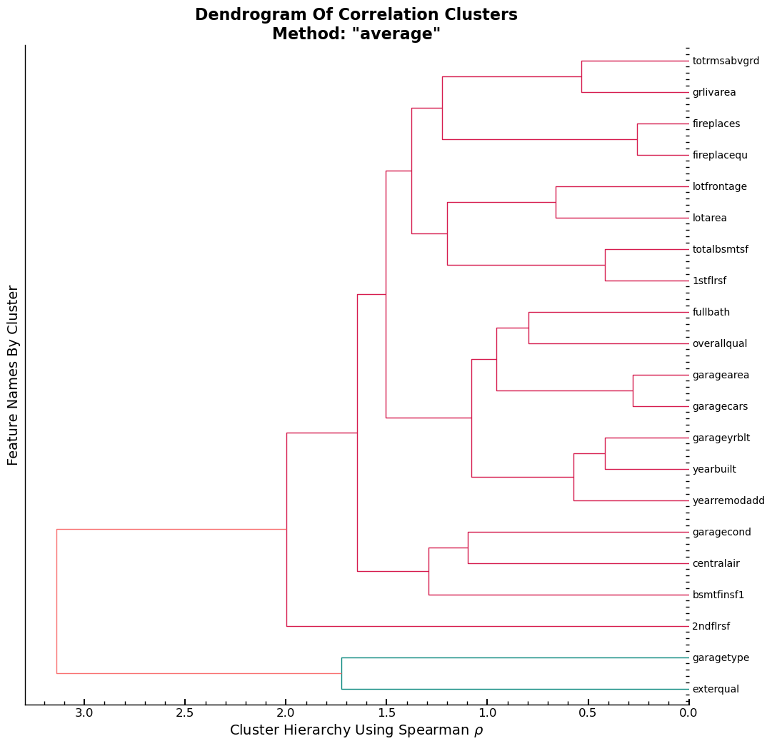
Conclusion
The output shows that variable garagetype and exterqual are assumed to have
a high similarity and are the two columns with the strongest assumed linear
relationship among the features found in xs_imp.
Dendrogram Findings Applied
To test what the impact of dropping even more features from xs_imp, on the
RMSE on the training set is, we look at the out-of-bag error (oob). The features
tested are garagetype and exterqual, since they showed to be the two
features with the highest pair correlation in the training set.
l = dict([(k,[]) for k in ['features','oob_score']])
def get_oob(df,n:str,l=l):
    l['features'].append(n)
    print(l)
    m = RandomForestRegressor(
        n_estimators=30,
        min_samples_leaf=5,
        max_samples=500,
        max_features=0.5,
        n_jobs=-1,
        oob_score=True,
        random_state=seed,
    )
    m.fit(df, y)
    l['oob_score'].append(m.oob_score_)
    print()
    print(f'oob using {n}: {m.oob_score_}')
    print(l)
    return m.oob_score_
The baseline oob score for xs_imp.
get_oob(xs_imp,'xs_imp')
{'features': ['xs_imp'], 'oob_score': []}

oob using xs_imp: 0.843435210902987
{'features': ['xs_imp'], 'oob_score': [0.843435210902987]}


0.843435210902987
The oob score for xs_imp is slightly lower than the one for xs. Considering,
that there are 83 columns in xs and 21 in xs_imp, the slight decrease in the
oob score shows that most of the difference in features between the two is made
up of columns that don’t decrease the RMSE of the model on the training data.
get_oob(xs,'xs')
{'features': ['xs_imp', 'xs'], 'oob_score': [0.843435210902987]}

oob using xs: 0.8521572851913823
{'features': ['xs_imp', 'xs'], 'oob_score': [0.843435210902987, 0.8521572851913823]}


0.8521572851913823
The two columns garagetype and exterqual are dropped and the oob score is
computed using the remaining features in xs_imp. One notices that the
oob_score is lower for the case where only one of the two features is dropped
and higher if both are dropped together. Accounting for this, both features are
dropped together.
Drop One Feature At A Time
Drop garagetype and exterqual one at a time, with replacement.
{
    c: get_oob(xs_imp.drop(c, axis=1),f'xs_imp.drop-{c}')
    for c in (
        "garagetype",
        "exterqual",
    )
}
{'features': ['xs_imp', 'xs', 'xs_imp.drop-garagetype'], 'oob_score': [0.843435210902987, 0.8521572851913823]}

oob using xs_imp.drop-garagetype: 0.8447838576955676
{'features': ['xs_imp', 'xs', 'xs_imp.drop-garagetype'], 'oob_score': [0.843435210902987, 0.8521572851913823, 0.8447838576955676]}
{'features': ['xs_imp', 'xs', 'xs_imp.drop-garagetype', 'xs_imp.drop-exterqual'], 'oob_score': [0.843435210902987, 0.8521572851913823, 0.8447838576955676]}

oob using xs_imp.drop-exterqual: 0.8443621750779751
{'features': ['xs_imp', 'xs', 'xs_imp.drop-garagetype', 'xs_imp.drop-exterqual'], 'oob_score': [0.843435210902987, 0.8521572851913823, 0.8447838576955676, 0.8443621750779751]}


{'garagetype': 0.8447838576955676, 'exterqual': 0.8443621750779751}
Drop Both Features Together
Drop both features together and compute the oob_score
to_drop = [
    "garagetype",
    "exterqual",
]
get_oob(xs_imp.drop(to_drop, axis=1),f'xs_imp.drop-{to_drop}')
{'features': ['xs_imp', 'xs', 'xs_imp.drop-garagetype', 'xs_imp.drop-exterqual', "xs_imp.drop-['garagetype', 'exterqual']"], 'oob_score': [0.843435210902987, 0.8521572851913823, 0.8447838576955676, 0.8443621750779751]}

oob using xs_imp.drop-['garagetype', 'exterqual']: 0.8500505935232953
{'features': ['xs_imp', 'xs', 'xs_imp.drop-garagetype', 'xs_imp.drop-exterqual', "xs_imp.drop-['garagetype', 'exterqual']"], 'oob_score': [0.843435210902987, 0.8521572851913823, 0.8447838576955676, 0.8443621750779751, 0.8500505935232953]}


0.8500505935232953
Evaluate oob_scores
Create a DataFrame and sort values by oob_score in descending order.
df_oob = pd.DataFrame(l).sort_values(by='oob_score',ascending=False)
df_oob
| features | oob_score | |
|---|---|---|
| 1 | xs | 0.852157 |
| 4 | xs_imp.drop-['garagetype', 'exterqual'] | 0.850051 |
| 2 | xs_imp.drop-garagetype | 0.844784 |
| 3 | xs_imp.drop-exterqual | 0.844362 |
| 0 | xs_imp | 0.843435 |
New Train & Validation Sets Using Resulting Feature Set
The resulting Datasets have the two features removed. These two datasets are the new baseline datasets that all the following models are fitted/evaluated on.
xs_final = xs_imp.drop(to_drop, axis=1)
valid_xs_final = valid_xs_imp.drop(to_drop, axis=1)
Exporting and immediately importing the datasets in their current state as
.pkl files using the fastai proprietary functions save_pickle and
load_pickle respectively.
save_pickle("xs_final.pkl", xs_final)
save_pickle("valid_xs_final.pkl", valid_xs_final)
xs_final = load_pickle("xs_final.pkl")
valid_xs_final = load_pickle("valid_xs_final.pkl")
Baseline RMSE Scores
m = rf(xs_final, y)
m_rmse(m, xs_final, y), m_rmse(m, valid_xs_final, valid_y)
(0.129697, 0.140712)
dfi = rf_feat_importance(m, xs_final)
plot_fi(dfi)
<AxesSubplot: title={'center': 'Feature Importance Plot'}, xlabel='Feature Importance Score', ylabel='Feature'>
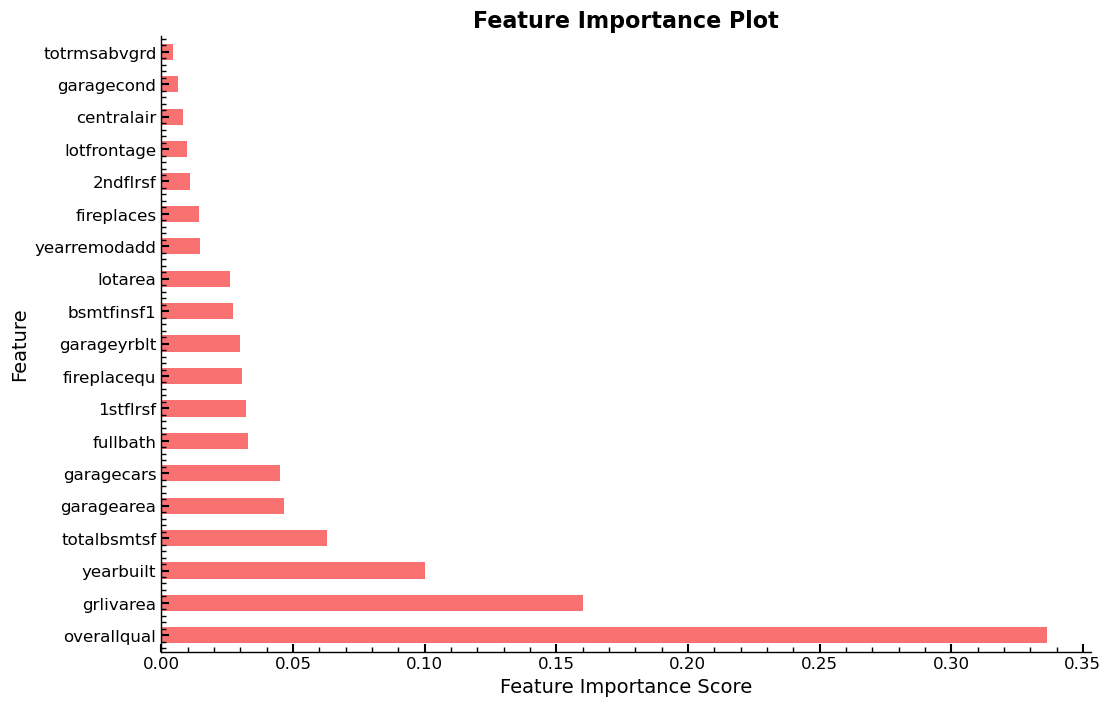
Exploring The Impact of Individual Columns
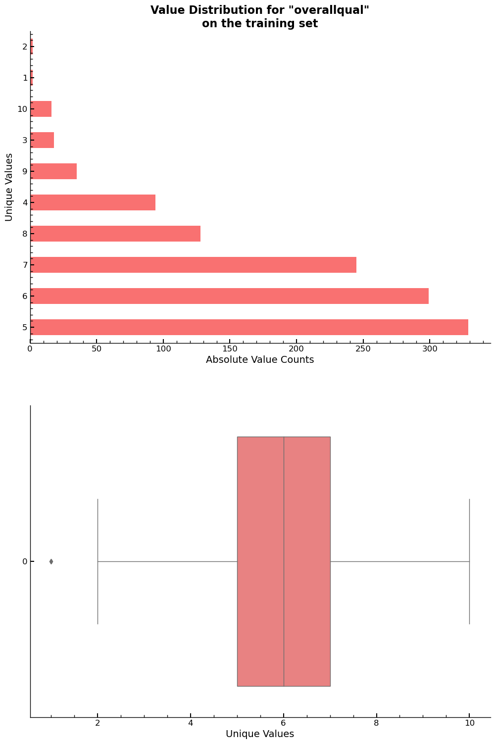
Column overallqual has shown to be the most important column overall relative
to all the other columns in the dataset. This gives reason, to get a detailed
look at its unique value distribution. The feature has ten levels, ranging from
two to ten in ascending order. It describes the “overall quality” of an object
and judging by the feature importance plots, it is the strongest predictor for
variable saleprice.
The value counts and the box plot for overallqual are given below.
xs_final["overallqual"].value_counts().reset_index().sort_values(by='index',ascending=False)
| index | overallqual | |
|---|---|---|
| 7 | 10 | 16 |
| 5 | 9 | 35 |
| 3 | 8 | 128 |
| ... | ... | ... |
| 6 | 3 | 18 |
| 9 | 2 | 2 |
| 8 | 1 | 2 |
10 rows × 2 columns
fig, ax = plt.subplots(2,1,figsize=(8,10))
ax= plt.subplot(211)
xs_final["overallqual"].value_counts().plot.barh(ax=ax)
ax.set_xlabel("Absolute Value Counts")
ax.set_ylabel("Unique Values")
ax.set_title(f'Value Distribution for "overallqual"\non the training set')
ax = plt.subplot(212)
sns.boxplot(xs_final["overallqual"],orient='h',ax=ax)
ax.set_xlabel("Unique Values")
plt.show()
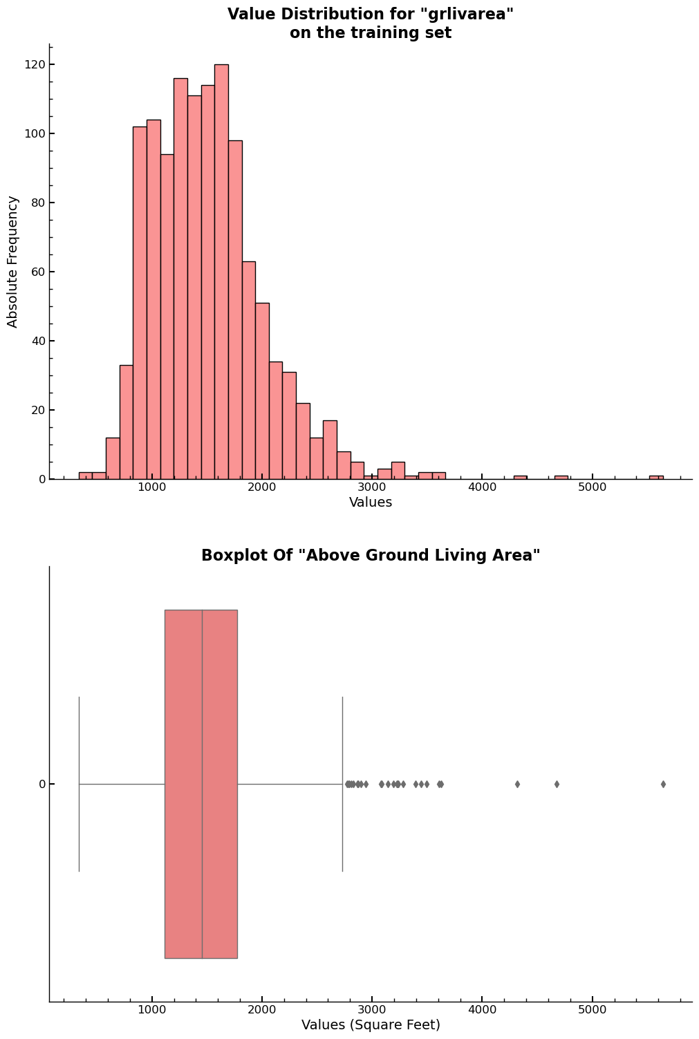
Another important feature is grlivarea, which gives the area above ground in
square feet.
fig, ax = plt.subplots(2,1,figsize=(10,10))
ax=plt.subplot(211)
sns.histplot(x=xs_final["grlivarea"],ax=ax)
ax.set_xlabel("Values")
ax.set_ylabel("Absolute Frequency")
ax.set_title('Value Distribution for "grlivarea"\non the training set')
ax = plt.subplot(212)
sns.boxplot(xs_final["grlivarea"],orient='h',ax=ax)
plt.title('Boxplot Of "Above Ground Living Area"')
plt.xlabel("Values (Square Feet)")
plt.show()
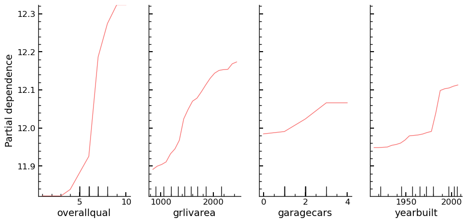
While the univariate distributions of the features are of interest, they don’t show the relationship between independent and dependent variable. The relationships can be visualized using a Partial Dependence plot.
Partial Dependence
Plots of partial dependence for the most important columns in the slimmed down dataset. The plot is part of the scikit-learn library and its documentation can be found here: partial_dependence Documentation. The plot is like an individual conditional expectation plot, which lets one calculate the dependence between the dependent variable and any subset of the independent variables. Four columns that have shown several times that they are of high importance for the predictions of the dependent variable are chosen and their partial dependence plots are created.
The output shows that overallqual and yearbuilt show a high correlation with
the dependent variable. Not only that though, the plot also shows how the
assumed change in the value of the dependent variable, \(\frac{\partial \mathrm{saleprice}}{\partial x_{i}}\,\,\mathrm{for}\,\,\mathrm{i}\, \in \{\mathrm{overallqual},\, \mathrm{grlivarea},\, \mathrm{garagecars},\, \mathrm{yearbuilt}\}\)
ax = plot_partial_dependence(
    m,
    xs_final,
    ["overallqual", "grlivarea", "garagecars", "yearbuilt"],
    grid_resolution=20,
    n_jobs=-1,
    random_state=seed,
    n_cols=4,
)
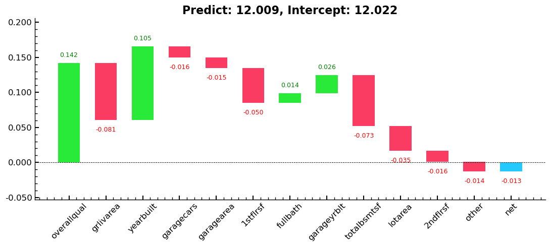
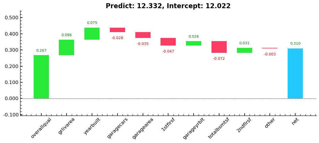
Tree Interpreter
A plot using treeinterpreter from treeinterpreter, and we try to answer the
question:
- For predicting with a particular row of data, what were the most important factors, and how did they influence that prediction?
row = valid_xs_final.sample(n=2, random_state=seed)
predict, bias, contributions = treeinterpreter.predict(m, row.values)
# rounding for display purposes
predict = np.round(predict,3)
bias = np.round(bias,3)
contributions = np.round(contributions,3)

print(
    f'For the first row in the sample predict is: {predict[0]},\n\nThe overall log average of column "saleprice": {bias[0]},\n\nThe contributions of the columns are:\n\n{contributions[0]}'
)
For the first row in the sample predict is: [12.009],

The overall log average of column "saleprice": 12.022,

The contributions of the columns are:

[ 0.142 -0.081  0.105 -0.016 -0.015 -0.05   0.014  0.026 -0.073 -0.005
 -0.007 -0.035  0.002  0.009  0.    -0.009 -0.001 -0.016 -0.003]
for e in zip(predict, bias, contributions):
    waterfall(
        valid_xs_final.columns,
        e[2],
        Title=f"Predict: {e[0][0]}, Intercept: {e[1]}",
        threshold=0.08,
        rotation_value=45,
        formatting="{:,.3f}",
    )
plt.show()
Entire Series:
Advanced Missing Value Analysis in Tabular Data, Part 1
Decision Tree Feature Selection Methodology, Part 2
RandomForestRegressor Performance Analysis, Part 3
Statistical Interpretation of Tabular Data, Part 4
Addressing the Out-of-Domain Problem in Feature Selection, Part 5
Kaggle Challenge Strategy: RandomForestRegressor and Deep Learning, Part 6
Hyperparameter Optimization in Deep Learning for Kaggle, Part 7
© Tobias Klein 2023 · All rights reserved
LinkedIn: https://www.linkedin.com/in/deep-learning-mastery/